Linda Secondari's Reading List
Using intelligent design strategy and inspiring design solutions, Linda Secondari believes we can improve the world through better communication. She’s been fortunate to do that for independent authors, major publishers like Oxford University Press, NGOs, educational institutions, nonprofits and think tanks. Now, as the founder and Creative Director of Studiolo Secondari, she helps organizations reach their audience and get their big ideas noticed through compelling print, web, and digital communications. Linda has received awards from AIGA, AUP, the NY Book Show, and the Stiftung Buchkunst Co
Open in WellRead Daily app →The Best Books for Graphic Designers (2021)
Scraped from fivebooks.com (2021-10-18).
Source: fivebooks.com

Josef Albers · Buy on Amazon
"Josef Albers’ Interaction of Color was newly released by Yale University Press to mark the 50th anniversary of the original publication. It is a truly beautiful book. As a book designer, I absolutely get suckered into the the beauty of a book. Mind you, I didn’t have this particular edition when I was in art school, when I was first introduced to Josef and Anni Albers . The colour exercises inside the book take me back to my student days, only they have been redone for this edition—really beautifully! This is foundational colour theory such as I studied when I was at Parsons School of Design and I love it so much. It just makes me happy. “What differentiates us from other forms of design is that we typically design to solve communications problems” Colour is one of those things which can be incredibly trendy. It can get highjacked by trends. Certain palettes come and go with the fashion, Pantone has the ‘colour of the year’, fashion designers talk about which is the ‘in colour’ for the season. Sometimes when you look at pictures of yourself from a long time ago, the two things that likely stand out are your hair, and the colours that you were wearing at the time. What I love about Albers is that his theories are not trendy. They are scientifically grounded, and often mind-blowing, as the examples in the book illustrate. Adjacent colours, though identical, can appear very differently to the eye due to their placement. In my previous position at Oxford University Press , I had a staff of 45 designers and art directors. I’ve been managing designers for a really long time. Sometimes I had to have ‘that conversation’ with them—that graphic design is not a fine art. It’s a craft, it’s a trade, it’s a skill. Hence we have The Graphic Artists Guild, and not, for example, a salon. What differentiates graphic design from fine art is that you have to solve a problem and you have to solve it for a particular audience, or indeed almost always for at least two audiences. One is the audience of the deciders, the gatekeepers or the people who hired you. In addition though, you need to communicate effectively with the ultimate audience who they gatekeepers want to reach, right? This is where theory can be inordinately helpful. Albers does not follow trends. We designers often hear things from our audience such as ‘I don’t like the colour yellow’. You hear that a lot when you work as a book designer. With this book I’m able to tell the client, very objectively, well, this is how the colour yellow solves your specific communication problem. I appreciate that as a tool in my toolkit."
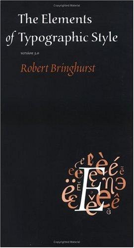
Robert Bringhurst · Buy on Amazon
"I’m actually typesetting a book of poetry right now. And I’m reminded of the very specific technical requirements of poetry as opposed to nonfiction prose. What would otherwise be minor considerations of point size or text width, rules about spaces above and below, indents. All of these loom large. If you are typesetting prose, the copy is not too threatening. Essentially it’s just running in a continuous flow. Poetry? Every single line has a meaning and how you break those lines up is deeply significant. Whether you continue on to a new page, or if you break a line or a stanza visually. Placement on the page is endowing incremental meaning to those breaks. “In poetry, every single line has a meaning and how you break those lines up is deeply significant” I would think that Robert Bringhurst came to typography perhaps even out of frustration with the typesetting of his own work. In 2018 I had the absolute honour of being a juror with him for the Association of University Presses book show. That was intimidating, let me tell you! Bringhurst is an acknowledged master of typographic design, and his book is regarded like a Bible in the trade. We went through the mountains of books you are asked to review, we each had our coloured post-its marking those volumes that we each thought deserved further conversation, ending up with a nicely sized pile of books that we both agreed on. Of course, we also had our distinct piles. To actually have the gumption to say, ‘hey, Robert, did you notice this cute little thing on this book?’ was really quite audacious of me. I think I managed to sway him on one or two, and he had absolutely noticed things that I had not noticed on other books. An amazing experience. His book, The Elements of Typographic Style is simply stunning in the way that it illustrates the concepts of typography that it describes. That itself seems to me to be the most perfect form of graphic design, right there. The book is executing as it explains, and illustrating as it describes. It’s both beautiful and aspirational for a designer to consider. And as you say, so beautifully written that it’s almost like a meditation . For certain it is one of those books that you can just open to a spread before you, read it and then pause to consider."
Philip B. Meggs · Buy on Amazon
"It is. I was lucky enough to have a history of graphic design class when I was studying. it’s always been one of my favourite classes. More than any other book that I had in school, I returned to the Meggs’ time and time again. My original, earlier edition copy is now pretty dog-eared. This new edition is a splendid update. “Turning its pages was a liberating way to break through the designer’s block that happens when you’re young and still relatively inexperienced” I will say that it is not all encompassing. It’s got a very Eurocentric perspective. It could be expanded to to embrace the great breadth of diversity of culture, I am aware of that. Nonetheless, the scope is breathtaking. It shows examples starting with cave painting in Lascaux and the earliest glyphs and following cuneiform all the way through illustrated manuscripts and books in our day. This volume is a very cohesive argument about the continuities and changes that design has undergone throughout history. The chosen examples are so beautiful in the edition that I have now, published by Wiley, in dazzling colour whereas my school copy contained merely a few colour inserts. It’s quite amazing to see these pieces rendered in colour. Anyone who worked with me early on knew that I always had this book on my desk, riffing on it as much as I could. It always presented an opportunity to play with important concepts. I would just flip through if I found myself struggling with a design problem. Turning its pages was a liberating way to break through the designer’s block that happens when you’re young and still relatively inexperienced. Simply to start thinking within someone else’s framework is always liberating, for me, at least. I credit this book for a lot of my early success. I’m grateful to Meggs for writing it. The internet makes everybody your neighbour. You can communicate with anyone, Zoom with anyone from anywhere, do a co-working session with and collaborate across time zones. I would hope that this is absolutely one of the great benefits of digital communication."

Paul Rand · Buy on Amazon
"Absolutely. His approach to branding, publication design and advertising was so innovative. Rand really saw so much opportunity for novelty, and always added a sense of playfulness to his work. At least his best work. I don’t think his Enron logo was particularly playful, but maybe in designing it so severely he was prescient in some way? I always appreciated that playfulness of his and I interpret it almost as a humanism, a sense of love and respect for his audience. With his designs, we’re all in on the joke. This is an ad, right? His best work has great aesthetic qualities, but he makes sure that we all know exactly what it’s for. Exactly. As an American designer he did so much to establish the credibility of the craft in America. His work paved the way and helped to elevate our standing as American designers. A Designer’s Art is also much more than just a design manual. It has a lot to say about art and visual appreciation more generally, with chapter titles like ‘arts for art’s sake’, ‘imagination and the image’, ‘the politics of design’. Politics is something that often seems to be quite closely intermeshed with the way that graphic messages are conveyed."

Stuart Wrede · Buy on Amazon
"I put together a group of books that a graphic designer could have on hand that would help them be inspired and also help them see how a range of people solve different problems and communicate different ideas. The poster similar to the book cover, which is really like a poster in the function it performs. It’s in some ways the ideal or aspirational product for a designer. I can only speak for myself—there are doubtless designers who prefer doing other sorts of work—but with poster design you have space to work with, you have colour, often not a lot of copy, and often there’s a very clear message that it is required to convey. For an event there may be important practical information that needs to be listed, but whatever the mandate, it is reductive and it’s an open-ended project. Just look at the variety of posters represented here. You can see that there are no limits. Whether you are designing a brand or a website or a brochure, I think that there’s much to be learned by looking at these examples of exquisite design, just to get your creative juices flowing. “When you’re talking to your client, really listen” At the end of the day, I appreciate well-written books about design , but for me, the visuals are key. Often I really just want to be able to look at some pictures, study the visuals, because I’m thinking of a problem that needs to be solved in a visual way. I don’t often want to get ‘trapped’ in words. Anyone who’s worked with a creative brief understands that people can come up with all sorts of solutions to a communication problem that sound logical and completely appropriate in writing. The minute you start designing a visual solution, however, you realise that the written version simply makes no sense. It doesn’t do the job it was written to do. I did try to provide books that if you wanted to, you could just flip through, and nonetheless learn so much if you do. By all means read, but first and foremost appreciate – take in the visual messages. When I started working in advertising and before I went into publishing, I was a cigarette smoker. That’s what designers did back way back then…. Me and Don Draper! When I felt creatively blocked I would go to have a cigarette outside—even then you were not allowed to smoke in the office. I’d bring one of these books with me and I’d sit in the stairwell of my building (which you weren’t supposed to smoke in either, as it happens). I would just sit in the stairwell with one of these books smoking, and I rarely got past half the cigarette. It was a combination of being outside of the studio environment and being by myself, but also looking at these images. And maybe a little bit of the nicotine. That combination was powerful, oh my goodness. I’d be stubbing out my cigarette to run back to the desk, because I’ve got work to do at the drafting table, and an idea to get it done! Smoking aside, I think it’s really important to listen. When you’re talking to your client and trying to gather the specifications for whatever project you are working on, really listen. Always observe. Keep up with what’s happening in the museums and movies and TV and music—and food, even. Know what’s going on in your culture. Then absolutely take time. Don’t expect it to happen all at once. Give yourself a few moments of mindfulness in the process to let the universe download some great ideas to use."