← All books
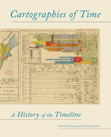
Cartographies of Time
by Daniel Rosenberg and Anthony Grafton
Buy on Amazon
What does history look like? How do you draw time? From the most ancient images to the contemporary, the line has served as the central figure in the representation of time. The linear metaphor is ubiquitous in everyday visual representations of time—in almanacs, calendars, charts, and graphs of all sorts. Even our everyday speech is filled with talk of time having a "before" and an "after" or being "long" and "short." The timeline is such a familiar part of our mental furniture that it is sometimes hard to remember that we invented it in the first place. And yet, in its modern form, the timeline is not even 250 years old. The story of what came before has never been fully told, until now. More at Princeton Press...
Recommended by
"This is a beautiful book, wonderfully illustrated with a plethora of examples of how historical time has been visualised across a broad chronological span. The notion of visually representing the passage of time dates back to antiquity. The chapter on Eusebius – how in the fourth century he used tables to match up the biblical account of time with ancient history – is fascinating. In the Middle Ages genealogies were often displayed on parchment scrolls, using variations on the tree theme. So there is a tremendously long tradition of tabular representations of time. But the timeline as we think of it owes a lot to the 18th century and to Joseph Priestley, the chemist. Priestley made a biographical chart in 1765 using a bar to indicate the life spans of some 2,000 famous people from antiquity to his own time. Nineteenth-century charts were incredibly detailed and colourful; they were feats of printing in addition to being feats of knowledge organisation. Timelines were used to illustrate change over time but also the simultaneity and overlap of past events. Computer technologies have made homemade visualisations possible. In the old days, printers controlled the creation of charts that could easily be disseminated. The charts were expensive and time intensive to produce so there was a tremendous bottleneck at the production level. Now we have all these tools at our fingertips. We can experiment with visual representations of knowledge and share them with others. But as the example of Eusebius shows, visual representations of knowledge have been around a long time. Medieval manuscripts had images to help people recognise where they were in a work and remember its contents. Although visualisations may facilitate new insights and make us aware of new connections in a new way, it’s worth remembering that visualisation has been around a long time."